DESIGN INNOVATION AT ILLINOIS
web interface ✖
Overview
In Fall 2018, Design Innovation at Illinois launched as a new student organization at the University of Illinois at Urbana-Champaign. Their mission is to build a community of students that learn and create at the intersection of technology and design by joining semester-long project streams.
In February 2019, my team and I began the development and design of their website to help establish their presence as a new design club on campus.
Date
February 2019 – Present
Team Members
Lucy Chang Babak Baniasad Arsh Chopra
Sylvia Peng Shubhangi Joshi
Deliverables
✖ Interface design for the recruitment page
✖ User research and testing insights
✖ Competitor research and analysis
Competitive Analysis
To begin, I conducted competitive analysis for two organizations with a similar focus as Design Innovation at Illinois. In doing so, I identified its info context, mission, target audience, design/features, and other features that stood out to me. I did research on:
Siebel Center for Design

-
New facility that will aim at fostering collaboration, ideation, risk-taking, and design-thinking
-
Promotes gathering of multidisciplinary disciplines
-
Previews blueprints and building concepts of the facility
Design for America at Illinois

-
Encourages interdisciplinary teams
-
Makes an impact on the community through human-centered design
-
"Project Spotlight" displays them putting their mission into action
Insights
I focused on the recruitment/apply page for the Design Innovation website. Through data points gained from competitive analysis, site mapping, and user interviews, I gained key insights on what users expect when trying to join a club or organization:
-
Call it the "Apply" page instead of "Recruitment"
-
Target a prospective group of members without sounding too exclusive
-
Be transparent about the recruitment process (if any)
-
Make the application easy to find
-
Clearly state if the application is closed
Ideation
Wireframing
Using my insights, I began developing the Apply page. During a 5 minute brainstorming session, I quickly sketched out an idea for the page. I later created a nicer paper wireframe that also integrated my team's ideas for improvement. Finally, I translated this into a mid-fidelity wireframe using Marvel.


Color Palette
My team and I decided against a University of Illinois color scheme (orange + blue) in order to distinguish DI from similar design-focused clubs, such as Design for America at Illinois. Instead, we chose a bold and fun color palette since we are—after all—a design club.

User Flow Testing
Mockup
To prepare for user flow testing, I designed my first mockup of the Apply page using Wix as our platform. However, I would still consider this to be a mid-fidelity mockup as it largely focuses on its design and layout rather than detailed content. This incorporated the use of our color palette, photos, hover buttons, and various fonts.


The Tests
I conducted two user flow tests which focused on navigation through the entire website. I encouraged each person to verbalize any confusion or difficulties they experienced as they moved from top to bottom of every page.
On the Apply page, one user test found the wording of 'who you are' weird and potentially limiting to the types of members we attract. You can see her back-tracking a couple of times in the screen recording.
Design Decisions
Header
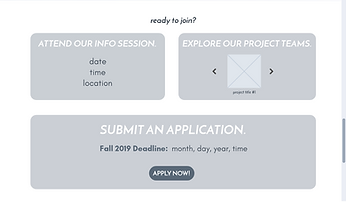
I made use of a photo carousel for the header to showcase what it might look like to work on a project team (e.g. collaborative, hands-on, etc.)
Wording
I changed the phrase from 'who you are' to 'who we're looking for' in hopes that the wording would sound less strict and inflexible.
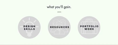
Hover Icons
To avoid making the page seem text-dense, I made use of hover icons. As you hover over each circular icon, corresponding information appears without taking up extra space on the page.
Apply Button
The 'Apply now!' button was originally a shade of red, prompting users to click it as if it would lead to an open application. I changed its color to gray to represent a "dead" button and added a statement about closed applications.